
TLDR
Changing the cursor just to make a website or app look fancier is often a bad idea. If its only purpose is to stand out, the user experience can quickly suffer. A custom cursor can still work: its click point must be clear, it must show appropriate states, and it must follow mouse movements without a noticeable delay. When its appearance obscures the actual target or makes precise aiming harder, I call this Target Overshadowing – obscuring the target.

Why change the cursor at all?
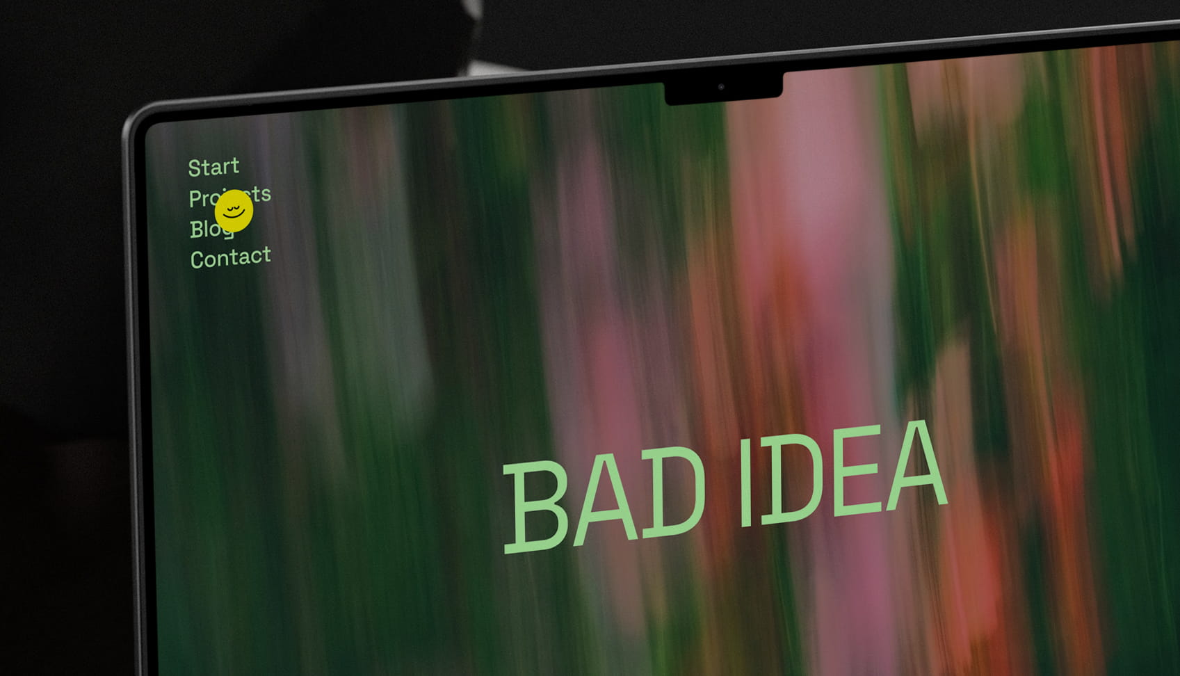
A large circle, a floating dot, an animated character: on some websites, even the mouse pointer gets its own design. Custom cursors are particularly common on portfolio and agency websites.
The thinking behind it makes sense. You want to create something distinctive, surprise people, and be remembered. If the entire website looks unique, why should the cursor look the same as everywhere else?
Because it is a tool people use to operate the website. Changing it also changes how they hit links, select text, and recognise interactive elements. That can work. But it takes more than an interesting shape.
Easy to build does not mean easy to use
Website builders and AI tools make it quick to create interfaces. An animated cursor can also be added with just a few instructions. That tells you nothing about whether it improves usability.
A smoothly trailing circle might look good in a demo. When you try to click a small link, that same effect can get in the way. A detail needs to hold up when someone actually uses the website.
When many websites look alike, it is tempting to make individual elements especially eye-catching. With the cursor, though, you should ask what the change does for users.
What the standard cursor already does well
The familiar arrow shape has a clear advantage: its tip shows where the click will land. Even with a small icon, you do not have to work out which part of the cursor counts.
The cursor also changes depending on the situation. It helps you recognise whether something can be clicked, selected, moved, or resized. These cues often go unnoticed until they are missing.
| Feature | System | Custom cursor |
|---|---|---|
| Click point | Clear tip | Often unclear |
| States | Match the action | Often unchanged |
| Movement | Direct | May trail behind |
| Target visibility | Mostly clear | May be obscured |
1. The click point must be clear
Circles and dots are particularly popular as custom cursors. They are easy to design and immediately stand out. But they lack the clear direction of an arrow tip.
Even a round cursor has a technically precise click point. Its visible shape does not necessarily show where that point is. Is it the centre? The top edge? Or somewhere else inside the shape?
On a large button, this uncertainty is barely noticeable. On a small icon or two closely spaced links, it is. If the cursor is larger than the target, it can also obscure it. You then have to hit something that disappears beneath your own tool.
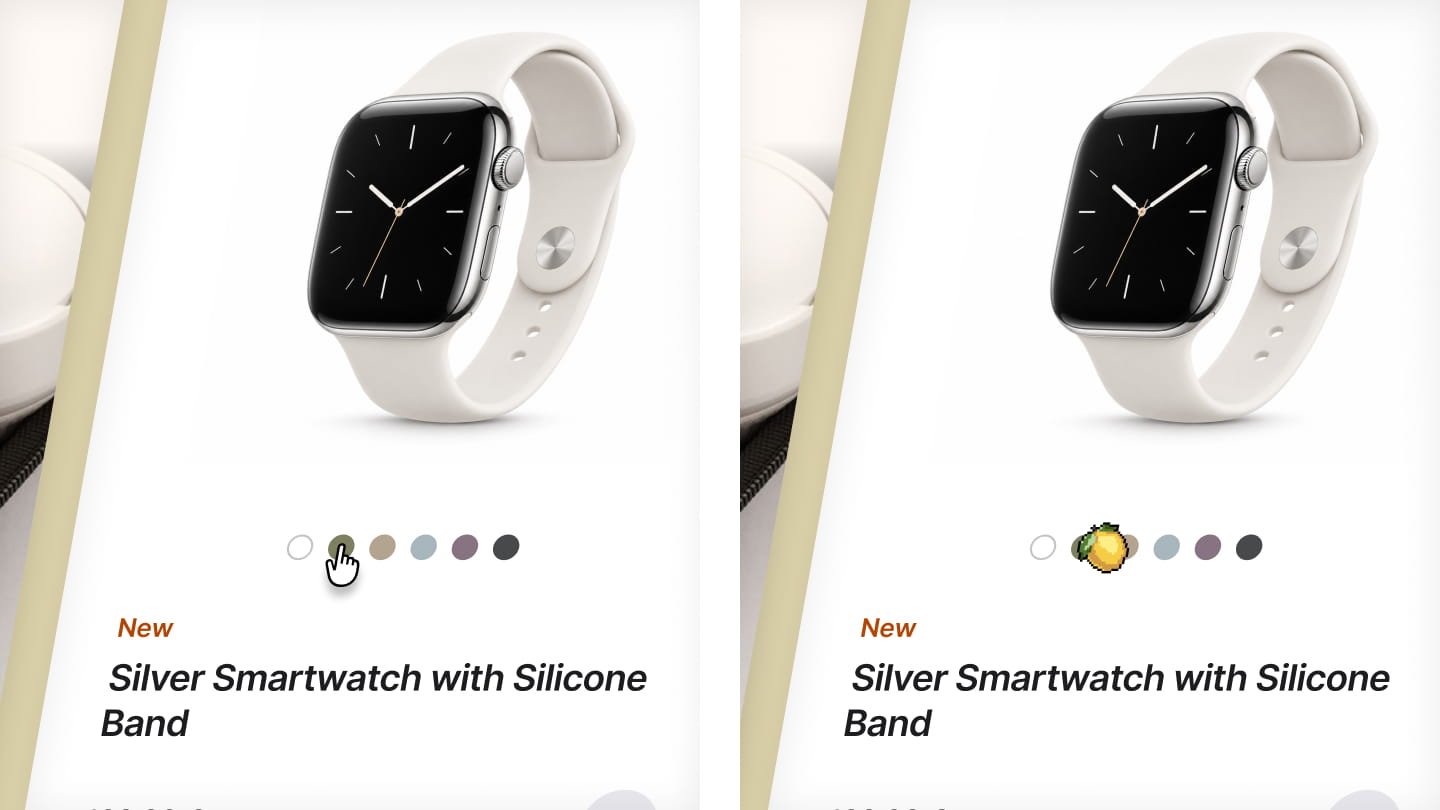
The problem is not that the click is technically imprecise. The appearance leaves its location unclear and may make the target harder to see.
Rule 1: The shape must clearly show where the click will land.
A tip is a simple way to achieve this. A larger or unusual shape can work too, as long as its active point is immediately recognisable and the target remains visible.
2. The cursor must show what is possible
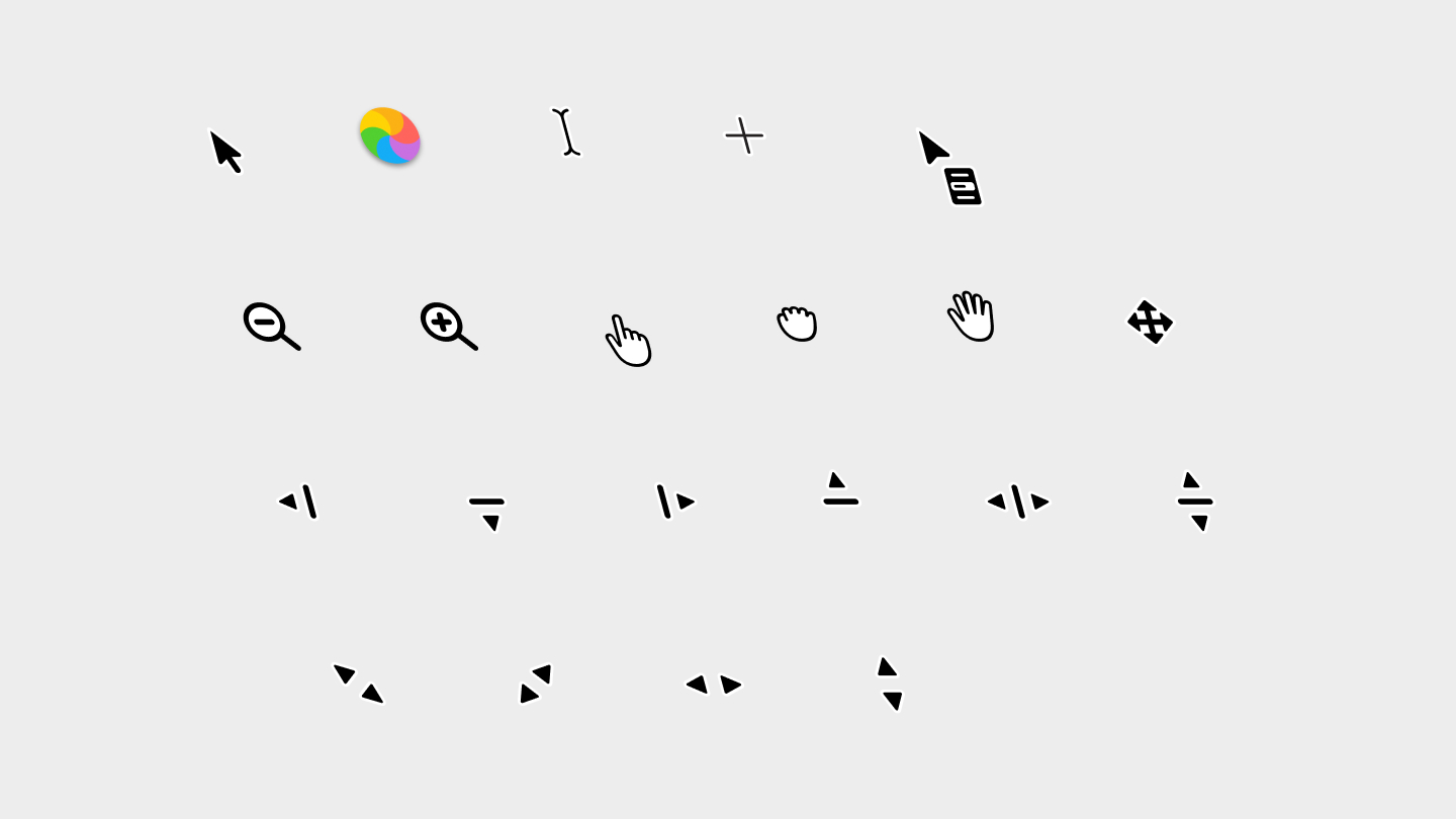
Before you act, the system cursor gives you clues about what you can do at a particular position:
- A hand often identifies links.
- The text cursor shows where you can enter or select text.
- Move and resize arrows help with dragging and resizing.
- The “not allowed” symbol indicates that an action is not possible there.
A custom cursor that looks the same everywhere removes these cues. You can no longer distinguish a link, a text field, and an empty area from the cursor alone.
Some websites enlarge their circle when it moves over a link. That can signal clickability. But if the circle obscures the link or nearby elements, it immediately creates another problem.
Rule 2: The cursor must match the interaction.
This does not mean every button needs a hand cursor. What matters is preserving useful cues. When selecting text or resizing an element, a familiar cursor is often the clearest choice.
3. The appearance must match the actual position
A trailing cursor feels smooth and playful. When clicking precisely, however, that delay can be confusing.
The mouse is already at a new position while the graphic is still catching up. The click happens at the actual pointer position. Anyone relying on the visible graphic receives conflicting feedback.
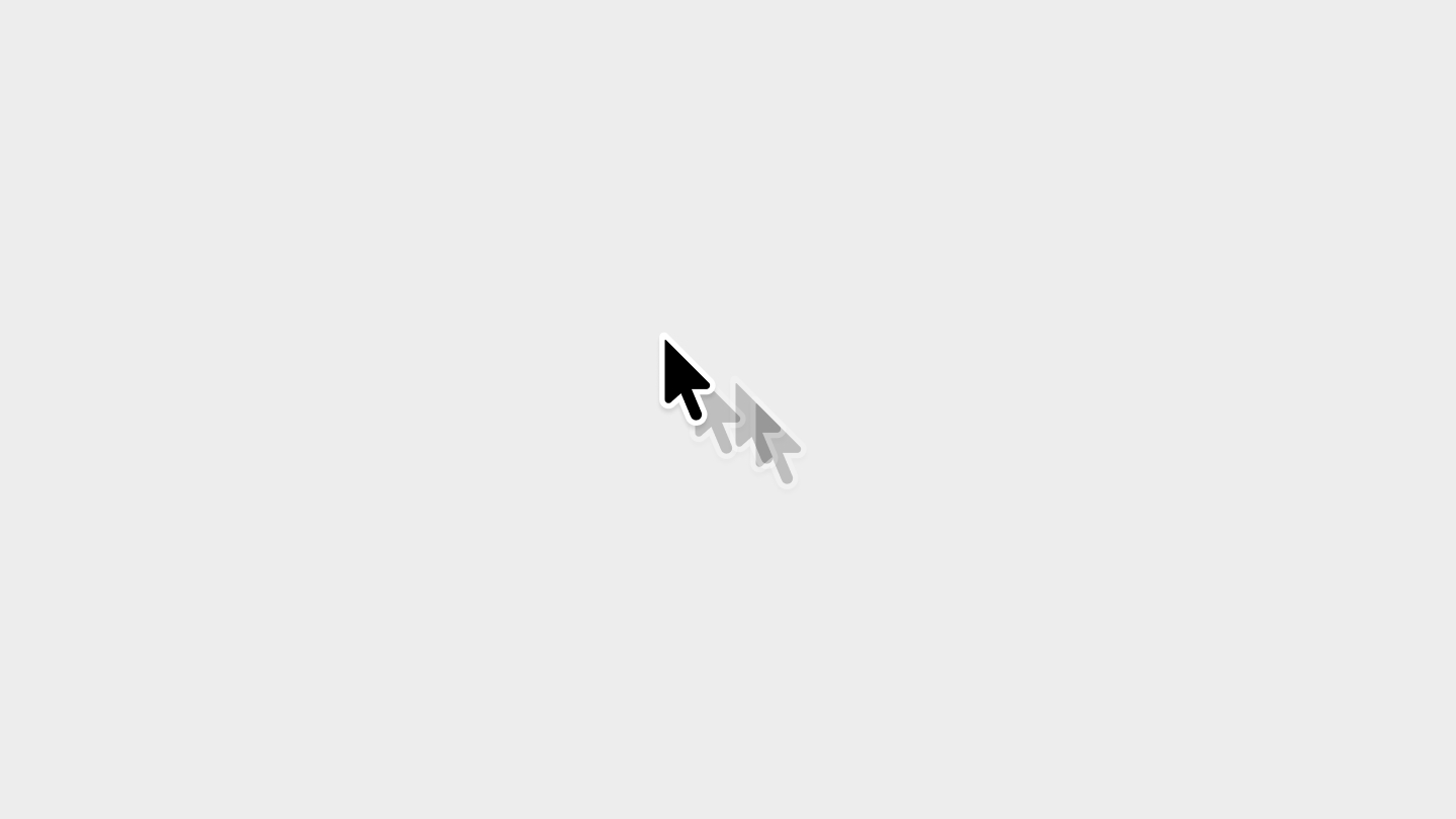
This mainly affects cursor effects where a script makes a graphic follow the mouse and smooths its movement. A custom cursor image does not necessarily have to respond with a delay.
It becomes particularly distracting when the normal cursor and its animated replacement are both visible: an arrow moves directly, while a circle follows with a delay. Both look like pointers, but they show different positions.
A decorative companion can work as long as the actual cursor stays clearly recognisable and the extra graphic does not get in the way. If the graphic replaces the cursor entirely, it must show its position reliably.
Rule 3: The visible click point must stay at the actual pointer position without a noticeable delay.
This also means respecting personal settings. Someone who has chosen a larger or higher-contrast cursor in their operating system should not suddenly have to work with a tiny, barely visible dot on a website.
What does this have to do with Fitts’s law?
Fitts’s law describes the relationship between the distance to a target, its size, and the time needed to reach it. Put simply: large, nearby targets are quicker to hit than small, distant ones.
If the cursor is larger than a link and obscures it, that adds another difficulty. The target is already small. Now it is also harder to see where it is and how the cursor is aligned with it.
This does not make the link’s clickable area smaller. That is why Fitts’s law alone cannot explain the problem. It also involves the visibility of the target and the clarity of the click point.
Small targets require precise aiming. A cursor that blocks the view or hides its active point can make that task even harder.
When a custom cursor works
A cursor does not have to be small or subtle to remain easy to use. A larger shape may even be easier to find. What matters is whether you can aim reliably with it.
A large body with a clear tip can combine both: distinctive styling and an unambiguous click point. A filled shape is more difficult when its active point sits somewhere inside it and it completely obscures small targets.
The best way to find out whether a design works is through concrete tasks:
- Click a small link among several others.
- Select a single word in body text.
- Make a fine adjustment to a slider.
- Resize an element by its edge.
If your custom cursor makes these tasks more difficult, you should revise the design.
Target Overshadowing: when the tool obscures the target
I call this problem Target Overshadowing, or obscuring the target: the visible appearance of a tool obscures the target or makes the actual interaction point harder to recognise.
This is particularly clear with custom cursors. A large circle can completely cover a small link. The user can still see the cursor, but no longer the exact element they want to hit.
Similar situations occur elsewhere in an interface:
| Pattern | Problem |
|---|---|
| Circle cursor | Covers an icon or links |
| Tooltip | Covers the next target |
| Slider thumb | Covers the scale or value |
| Hover card | Covers the next item |
| Drag preview | Covers the drop position |
Large is not inherently bad. A large slider thumb can be easier to grab. It becomes a problem when its appearance obscures the information needed to use it.
The term describes my observation and is intended as my own definition. Whether and how much a particular design affects usability needs to be tested in its own context.
A custom cursor can stand out and be fun. But clicking with it should feel just as natural as clicking with the familiar arrow.
FAQ
Are custom cursors bad for UX?
Not inherently. What matters is whether users can still tell where they are clicking and which elements are interactive. It becomes a problem when the design makes aiming harder or the cursor responds with a delay.
What does Target Overshadowing mean?
I use Target Overshadowing to describe a cursor’s visible shape covering the target or making its click point harder to recognise. It is my own term for this observation, not an established UX term.
When is a custom cursor useful?
When it serves a specific purpose, such as clarifying a possible interaction or representing a tool. A purely visual change can also work, as long as the interface remains understandable.
Does a custom cursor violate Fitts’s law?
Not automatically. A different cursor does not make the clickable area smaller. An obscured target or an unclear click point can still make aiming harder — Fitts’s law alone does not explain this problem.
Why can a circle cursor make clicking harder?
A circle has no tip pointing to the click point. Without an extra marker, users have to infer its position from the shape. This can make selecting small or closely spaced links harder.
Are large cursors always worse?
No. A larger shape may be easier to find. What matters is that the click point remains clear and the shape does not obscure information needed for aiming.
Does a custom cursor have to change shape on hover?
It should clearly communicate when an element is clickable. It does not necessarily have to become a hand: a clear change to the cursor or the element can also indicate this state.
How do I test whether my custom cursor works well?
Ask users to select small links, neighbouring navigation items, and different controls. Watch for misclicks, hesitation, and corrective movements. A comparison with the standard cursor shows whether your design makes the interface harder to use.